New Growth

I had a myrtle in a pot that died. The pot sat unwatered for a couple of weeks.

Then I saw that something was growing in it–a seedling. I wasn’t sure what it was or what it could be. I thought for some reason it might be a petunia.

I didn’t know how the seed had gotten into that pot. Later I realized that I regularly dump water out of my seedling trays into flower pots to conserve water. A seed must have been washed out of the tray and into the myrtle pot and decided for some reason to germinate.

Even when it put on its true leaves, I didn’t know what it was. I thought it might be a weed.

But eventually I began to suspect that it was a white henbane. The little leaves were hairy and bit more jagged than black henbane.  And I had tried to grow some white henbane a while ago but had run into some problems. My space is not the best for growing plants that are not tropical.

So I thought I’ll wait and see what it is. Might have to wait until it flowers, if it does.

The thing grew and grew. And eventually I was pretty sure that yep, it was a white henbane. The stems are very hairy and the leaves are wonderfully jagged.

white henbaneToday I was looking at it from across the room and saw something that looked suspiciously like a flower. I walked over to the plant and yes! A couple of white henbane flowers, the kind with purple tubes.

My heart leapt.

Henbane is becoming my spirit familiar plant. I have always loved its scorpionic flower stalks (because I have four planets in Scorpio), its absolutely beautiful leaves, its rep, and the fact that at the same time, it has never just fucked with people like belladonna or not known its own strength like thornapple. It’s like it doesn’t have a big narcissistic ego. Instead, it has been a friend to humans, with dependable medicinal (and magical) uses for many, many years.

And it’s just a beautiful plant, especially IMO the white henbane.  This is thought to be the henbane of the witches, because it was used medicinally, it is less noticeable than the black henbane (shorter, flowers blend in more), it has less in terms of alkaloids (less is more in terms of those guys), and it is way more predictable than the other nightshades that contain tropanes.

I’ve grown it in the past and sell the seeds for it. And here it was, turning up against all odds and being wonderfully beautiful.

It was this plant that inspired me to paint “New Growth.” The leaf shapes featured in that painting have nothing in common with the shape of henbane leaves, but the greenness and sturdy, wonderful juiciness–that does have to do with that white henbane plant.

new growth fb iI’m very happy with the way the painting came out, especially because at the beginning, I thought it was trash and that I should just take it off the gatorboard I tape my paper to. But as I went along, I could see where I could go with it, and further, I could see future paintings along the same lines.

I finished it and am pleased with it.

Because of it, I also had an idea this evening after going to the local distillery and getting some candy cane spirits (that I am having with cocoa and vanilla extract right this minute) of doing a full sheet sized painting of the Kabbalistic Tree of Life to enter in the Pawtucket Foundation show. I think I can really do that and that it will be a good painting.

So thank you, Henbane Spirit. You are a kind and happy spirit, and you are helping me.  Maybe the gods bless you!

Voices of Our Ancestors

voices of our ancestors fb iI finished this 15 x 22″ mixed media painting this morning, and I am pleased with it, although I want to take this concept a lot farther. I used granulating pigments in watercolor to do the rocks, with a dark green to represent algae from moisture growing on the rocks, making them more alive. The paper is Arches CP, but I would like to try something similar on Rough in the future. I was using Saunders Waterford for years but I must admit that Arches really does take scrubbing. I scrubbed off a section in a corner with Magic Eraser and the paper was not harmed at all. That would not be the case with Saunder Waterford. I actually quit using Arches back in the seventies because it gave off a sickening smell when it was wet, but I guess either they changed whatever was causing that or I didn’t get the paper wet enough.

I have been doing a lot of dry brush work, and I did that on this one. I started with painting and spraying with a hair mister (these cover a much more with a very fine mist than the ordinary spray mister). Dried it with a hair dryer and then did a couple layers of dry brush to bring out the rockiness of the rocks.

From there I used liquid watercolors and metallic ink to do the symbols. I got interested in asemic writing a little while ago and have done one other painting, Incantation, using that concept. I have wanted to do a lot more with it and chose this painting for that focus. I created the symbols out of my own subconscious rather than using those of a particular culture. I wanted the symbols to be unmoored from any singular meaning so that they could mean for anyone who looks at them–the meaning can be inserted by the viewer.

voices of our ancestors detail.jpgI used red, black, and green Hydrus watercolors and titanium pigment dispersion with QoR watercolor medium for most of the symbols, but I also chose to use gold calligraphy ink for some of them. I like the effect of metallic inks that they are especially bright only from certain angles and otherwise are not very noticeable. I want this to mean that sometimes we can only know something through a sidelong glance rather than looking at it directly. I also deliberately wiped out some of the symbols to represent how knowledge gets lost.

I think in the next painting I will vary the size of the symbols a lot more and perhaps make some of them transparent.


Watercolors

I felt like I’d gotten a bit stuck with oils recently and so decided to try watercolors again. I get a little irritated with my tube watercolors because they are so small and so expensive than my oil paint tubes. I know–I shouldn’t compare apples to oranges. I was wishing I had my pigment dispersions back, and it turned out that I had not in fact thrown them out for getting thick and even hard in the bottles. So I went through them all, adding water where necessary, and started painting with them again, just putting some on my palette and adding some gum arabic solution to them as I went.

I forgot how pleasurable painting could be. The brush moves with hardly a touch and I can paint very fine lines if I want to.

The second painting I did (“Heart of a Doll”) sold within 8 days, which was a great boost to me because I was afraid that I was not going to get anymore sales due to focusing on just what I want to paint instead of what I think will sell. I was faltering due to that fear, even though I kept telling myself that I simply have to persevere and that if I keep to my vision (or at least FIND it), the sales will come. The sale of this painting gave me the confidence to go on and try other things in watercolor.

I’m using up my 11 x 14″ paper and will be moving to much larger sheets when I’ve used it all. I have always been very concerned that people would not buy larger watercolors or that I could not do such paintings, but now I feel certain that I can. I also checked frame prices for large watercolors and they were not at all as bad as I had thought. That was a great relief. In the past I had done things like treat a watercolor painting with cold wax and mount it on a board in order to offer people something they did not have to frame. But now I feel like it’s fine to let people decide how they want to frame it–tons of other watercolorists do that–and it certainly gives me much greater confidence in painting, since I am not good at doing things like mounting paper on board and since cold wax deepens some colors but makes white look grimey. And I’ve been doing a lot of experimenting with white, even bought some QoR titanium white (I dislike the smell of QoR) because someone online said it was whiter than other watercolor paints–and it is. I want to use that color a LOT more.

Other great thing about painting on paper is that it is way cheap to ship, and I no longer have to worry about a big bite into my profit on a painting due to absorbing much of the shipping cost of a board or even a canvas.  I can go up to 36″ wide and still ship in a 4″ tube. These things matter. To me anyway.

I did run into a huge mess with my studio due to the powers that be in my complex deciding that they had to install walls with steel studs right above me. The noise has been incredible, and tons of lead white paint and filth from the past century rained down all over my belongings, including supplies and even paintings. Depressed me a lot. I felt like just throwing all my paintings out.

I had been working on a watercolor painting I liked but when I went back to work on it after spending hours cleaning the place up, I could not do it. It felt contaminated, so I threw it out.

A few days later, I went back and started something else, also 11 x 14″. No title yet, and still plenty to do:

wip 111719

There are a lot of things I am loving about using watercolor again. Two of them are easy cleanup and no waiting for paint to dry. But more important for me right now, I think, is that using a different medium is allowing me to take risks I wouldn’t take otherwise. I don’t feel guilty about throwing out an unsuccessful painting when it’s on paper, although I bet I will feel differently about that when I get to bigger sizes. But even then I will know that if a large painting is a fail, I can use the back. Can’t do that with other supports.

I was always so hesitant to do larger paintings when I used watercolors in the past. Now I look forward to it.


Inspirations

supports ready to goI’ve got a bunch of supports ready to play with for oils (seen here) and for watercolor. The green ones are just about dry enough to work with.

Went to the opening of “This Land Is…” at the Pawtucket Arts Collaborative gallery last night, where my painting “Morning Shore” was hung. Plenty of people were there, and I saw a couple of watercolor paintings that inspired me. One was by Robin Beckwith and used the technique of crumpling up the paper before painting on it, which gave some interesting lines. Also, the color on that one was fab, kind of beet juice, which I understand is one of the Pantone choices for home decor for 2019. I usually don’t care much for Pantone’s choices–they tend to be kind of bland, IMO–but I love this beetjuice color and one of their other choices, which is kind of a mango orange.

september studio windowsillThe other painting was quite large (40 x 40″) and consisted of hundreds of small rock-like bits painted in earth colors. Both were framed with acrylic glazing, and I thought both of them would look so much better with a cold wax finish. But then they would not be watercolors.

Here are the gourds I bought last week for inspiration. I love their textures and colors. As you can see, I started a little painting of that squash but haven’t gone back to it yet. Might finish it or might paint over it and do something else.

Cursed Painting

I had a whole screed about my misadventures with a frame, but I deleted it because it was boring to read. You’re welcome. Instead…

I agonized so much about the Sickle painting. When I saw that there were a couple of faint smudges in the apron area after I turned in the jpg, I asked the gallerist if I could fix that and retake the photo and send that to the juror. We still had another day before the deadline, and she said yes. So I got to work fixing up the smudges–with some white acrylic. It looked perfect. And I didn’t feel bad using white acrylic on a watercolor painting because I had submitted the painting as mixed media–I knew I was going to use cold wax to seal it anyhow.

Cold wax looks great on watercolor with one problem I remembered from when I was doing a lot of watercolor back in December/January–it can make white look dingy. So as I applied the wax, I kept my eye on the wide expanse of her apron.

babys first sickle apronAnd to my horror the acrylic paint I’d used to neaten up the apron was now a different color white than the white paper that constituted most of the apron. The more wax I applied, the more apparent the difference.

Instead of fixing the painting, I had ruined it.

I thought maybe I was putting too much into the slight difference in color and that probably (or maybe) no one would notice it. Because otherwise the wax made the painting look absolutely fabulous. It is the perfect finish for this type of painting. Just a subtle sheen and a slight deepening of the color and in fact the white of the paper did not get dingy looking. As I remembered, that had happened with titanium paint. But the acrylic paint was titanium, and instead of looking dingy, it looked like snow, blue-white, compared to the more creamy white of the paper. Sheesh.

I was so worried about this issue that I decided after sending the new photo that I would completely redo the painting before the show. I would just do it over. I had plenty of time to do that–the painting had taken only two days. Heck, I could make it a better painting!

Like this is ever allowed. Once you have sent in a jpg, you are not supposed to touch your painting.  But!!!

black tower fb i eI got the results of the jurying, and while “The Black Tower” got in, “Baby’s First Sickle” did not. I was actually relieved.

But I also had a superstitious reaction. I wondered if the problems I’d had with it were a sign that I should not be doing this kind of painting. In essence, maybe the painting was just “not meant to be” (said in scary Vincent Price voice). After all, such paintings are completely the opposite of the landscape oil paintings I’ve been doing lately (unlike “Black Tower,” actually) that I feel really good about. The Little Demon painting was tight and detailed and used local color, totally different from the new oil landscapes, which are loose, blurry, and intense in color. Was this some kind of sign I should just focus on the oil landscapes? Like if I kept it up, would Something Bad happen?

But I have so many ideas for the Little Demons. And I think this is a pretty good painting, outside of the apron mess.

Today I got the frame that I’d chosen for this painting, and it’s beautiful–an old-fashioned frame with lots of ridges made to look like it’s got gold leaf. Just perfect! I put the painting inside the frame and hung it on the studio wall.

I love it so much that yes, I will be doing more Little Demons. I’ll just be careful not to use any acrylic on them.

Breakthrough

I’ve been experimenting on small supports with watercolor, which has allowed me to be a lot more adventurous in terms of color and style. I feel like I have made huge strides in my watercolors and look forward to doing much more and to eventually working with larger supports, although I will keep doing the small ones in order to offer people more of a range of prices and for me to keep feeling good about experimenting because I’m not “wasting” paper.

This morning, though, I went over to the studio and took out the little gessoboards that I bought to supposedly paint still lifes on (and later rejected that idea, although I did buy a beautiful little orange squash I would like to paint, because orange). I thought I would try out some of the water studies I had planned to do on large canvases. I had one such canvas ready to go, the blue gradient already painted on. But then I thought I might try the water studies on the small gessoboards instead. A lot easier and faster to work out issues in how to paint these things.

I started painting and then sat there looking at it. I thought, I can put this aside to dry, or try to do wet-in-wet with it, or…

I kept seeing shapes in the paint and I decided, what the heck, this thing cost like two bucks, I can afford to “waste” it. I said to myself, “Let it arise”–let the image arise from the subconscious or wherever it comes from, maybe the spirit world, maybe the gods, maybe the muse, maybe a dream I forgot when I work up.

hedge
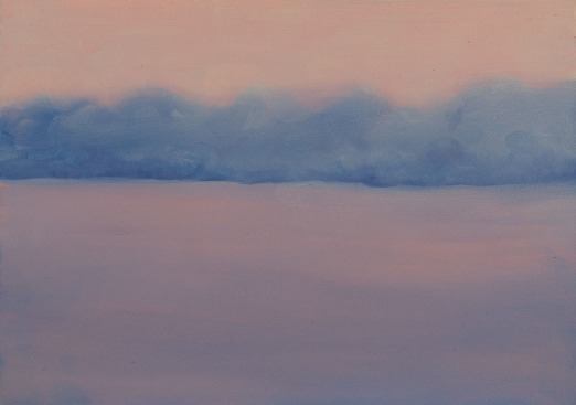
And it worked. I liked the blurry, simplified row of trees as if in the fog that I ended up with and pulled out another gessoboard. That one I used much more intense color, because after all, isn’t that what I’m experimenting with in watercolor? And I have liked my results there, so why not try it in oils?

I got two more paintings done with intense color, simplified shapes, and blurry outlines. What’s more, I used my fingers.

near the waterThen I decided to take something large that I got halfway through and abandoned (twice) and to paint over it with this same technique. I got that started and will let it dry before I go back to it.

I feel very pleased with my three little oil paintings and will photograph them or scan them when they are dry. One I might want to add more color to–the first one, which is mostly just blue. It could use some pink and pastel yellow, I think. Make that baby just glow. [I did add a pink glaze over it, which I think improved it hugely.]

I feel like I had a major breakthrough this morning. I think this can be my style–rich, dark colors, simplified forms, blurred outlines, and finger painting. I’ve got to look more into the health aspects of finger painting, but I do have some finger cots already that I can try if I want. I have used a liquid glove in the past, but not for painting, just to make the paint easier to wash off my skin when I’m done. I’m not sure how it interacts with the paint or even if it does. Seems like it would be rubbed off with painting anyhow.

Well, I am pretty darn happy. I came back to my loft because me and the cats had to have breakfast. But I will be going back over to do more.

Persisting

I decided I wanted to keep experimenting with dark watercolor, and that has been going pretty darn well. I am even starting to feel like I am developing a style with it. In this short amount of time! Maybe because it is so different from other things I’ve done.

blue roadIn some ways, it feels like a traditional landscape–fields, forests, ponds, houses. But in other ways, it is way not–deep rich colors, simplified shapes. using wet-in-wet as much as possible. I think the best paintings among theme are those that depict a scene at night. Like this one I finished this afternoon, Blue Road.

One of the things that is helping me along these lines is a watercolor technique for creating more intense color that I read about on Bruce McEvoy’s site, handprint. It involves making a mixture of 1 part gum arabic (the liquid stuff) to 2 parts water. He says distilled water, but I am using just plain tap water because I don’t have easy access to my Berkey-style water filter in my studio. You put 2-3 coats of this mixture on the paper before you paint on it. I’ve been using the hair dryer between each layer and doing 3 coats. Then try not to go over and over anything you paint and to use plenty of pigment.

This technique really works. I am using it on cold press. The paint does not sink into the paper, nor is it easy to remove. It also doesn’t move around as much, so if you spray it with water, it takes a lot more to get it to run, and they are way less likely to granulate. So less texture, more color. The two paintings I’ve got on this post were not manipulated in terms of their color in any way. I just scanned them and posted them. You can see how rich the colors are.

I have been using Hydrus liquid watercolors for a while and mentioned how much I love their Payne’s grey, which granulated fabulously. But with the two paintings I did today, I got out of my pigment dispersions that I was using to make casein and watercolor paints a while ago. These are a mixture of finely milled pigment, water, and a surfactant or some kind (basically, soap). They are very intense, and you can use them to make watercolor, casein, gouache, egg tempera, or acrylic. I have a good selection of these dispersions (so many cobalts!) and they are so easy to use (and cheap!).

memory of a pondA color that I have often loved in various mediums is indanthrone blue (PB60). This is what I started the Blue Road painting with. Daniel Smith has got a nice blurb on it. I personally really dislike phthalo blue (it looks like marker to me and it is way too strong), and I got used to substituting indanthrone blue for prussian blue when I used acrylics, because the pH of acrylic binder is a little hostile to prussian blue. I don’t have any indanthrone blue oil paint (having fallen under the spell of cobalt), but I do have plenty in watercolor form. The Guerra pigment disperson of indanthrone blue actually comes in a red shade and a green shade, just like phthalo blue. I bought both, and here I used the red shade, which is just slightly apparent as a sheen in the mass tone in the darkest parts of the painting. It’s pretty wonderful. Here it is a titch more diluted in “Memory of a Pond.” I know I’ll be playing with this pigment more in the future.

It was great to use my pigment dispersions again too. These are even more intense than the Hydrus, although they are also a bit thicker when the gum arabic is added.

Yesterday I found out that my painting “Morning Shore” morning shore i fb ewas accepted into a show at Pawtucket Arts Collaborative about landscape called “This Land is Your…” Only 1/3 of the entrants were accepted, so I feel pretty good about this. I just ordered the frame today; I didn’t have anything on hand that would fit it. This is the first time I ordered a light wood colored frame. I always get black, but this painting is very high key and dreamy, so I got birch. I am glad I am painting on supports that are not so thick nowadays.

Speaking of frames, messing around looking for frames for watercolor, I found a reasonable source of a competitor to museum glass called Artglass: hyperclear, anti-reflective glass for art. This won’t work for competitions (because they pretty much always say ‘no glass’), but it would be great for local shows.

I also bought something yesterday I’ve been wanting for a long time but just felt like I could not justify buying: soft pastels. I’ve always liked the pigment intensity of this medium but have shied away from it due to the dust and to the fact that I have tons of watercolor and oil paints. But I saw how Redon used them in his painting and ever since then, I have wanted to get some and try them on watercolors. Yes, it would be mixed media. And it would mean having to frame with glass or acrylic and matting and all that. But I’m going to have to do that with watercolor paintings anyhow. Even though I did a lot of experimenting with different ways to seal watercolors so that glazing is not required, I was never happy with what wax, for instance, does to white pigment or white paper. It makes it look kind of dingy or grey.

I do have plenty of stuff yet to make casein, and that is one thing that can help pastel particles stick to paper. I have a recipe for the equivalent of Spectrafix, which just helps them stick; it doesn’t seal or varnish pastels.

Then I found out by accident (because basically I know nothing about pastels) that certain types of paper, like plain old watercolor cold press, will help the pastels stick. ‘Course, coating the paper with gum arabic beforehand might affect that. We’ll see.

Lots more to say, but this is long enough!

Well, hell

I’ve been struggling with the content (and style, but not as much) of my art for years. In the past year, though, I have felt a greater focus and a sense of what I want to paint. I’ve been calling that the Mystical Landscape. Most of my paintings are rooted in landscape, and for a long time, I really struggled with whether I wanted to paint traditional landscape paintings, like, for instance, the Luminists, or whether I wanted to do something a little more unique, a little more me personally.

I was very torn about this, and one of the big reasons why was because I could not tell exactly where that “me” was. Without that information, without a solid feeling of me, how could I expect to be able to paint something other than traditional?

The few times I created a successful abstract painting, it was so incredibly freeing. I didn’t have to try to make what I was painting look like what “everyone” thought it should look. I only had to be successful at recreating what was in my mind. That’s much more difficult than most detractors of abstract art can understand.

Anyway, I kept struggling with whether I should try to paint traditional landscapes, paint abstracts, or paint surreal landscapes as a kind of middle ground between the two. I felt like I was not succeeding at any of these things because my heart was not fully in it. There was too much static and noise.

This especially came to the fore when I had to give up acrylics for health reasons at the end of last year. This resulted in a lot of flailing around with mediums–from watercolor to casein to gouache, with a foray into oil, which I thought was wonderful but I couldn’t stand the smell of the oxidizing oil in my living space. Not to mention the amount of cat hair and lint and dust in my paint.

Then I had the idea of getting a studio. I knew if I got one that I would spend a LOT of time learning how to paint with oils, and I knew that I could become a competent oil painter. The fact is that for me, oils are easier to handle than acrylics ever were. I know this irks some oil paint snobs, but too bad.

I did end up getting the studio, which I can barely afford. And it has made a mammoth difference in my work. I have become far, far more productive and more adventurous.

And yet this past week I found myself retreating from that adventurousness. And if I am honest, it has been mostly about money.

The paintings I have produced in the past year have not sold anywhere near as well as the paintings I was doing last year with acrylics. My works have been rejected from shows and simply not purchased even in print form. It’s been discouraging. Very much so. It undermined my confidence and made me totally question my direction, which I thought had gained clarity. And yet no one wanted to buy what I made.

So what did I do? I got to thinking about how maybe I could do some traditional work. I do admire the technique of some of it. But more, I admire the sales.

I had been messing around with my watercolors, trying to learn how to paint wet-in-wet, as it is much more conducive to my mind to doing abstracts or dreamy stuff than painting wet on dry. I decided to try doing a bit more traditional stuff with them. And I produced some things that were okay–and one person thought a couple of them were worth buying even though I didn’t even have them for sale, for which I am very grateful. This got me thinking I could do a lot more traditional stuff and maybe sell it. And these were just tiny things, max 5 x 7″, so where was the problem with that? Could something so small contaminate my vision or sap my artistic strength, like some people warned? I didn’t think so. So I started doing those.

They are okay. But they are nothing to write home about. They will never make anyone gasp, like happened with my dreamy oil painting “Morning Shore,” which is under consideration for a show right now but which I still have up on my art home page. Still, the little watercolors were pleasant to paint. A challenge only in terms of technique.

Then I came across someone who is doing small, kind of Impressionist still lifes of fruits and vegetables that are selling pretty good. Not jillions, but enough to make a difference. And I thought, “I can do that.” I would like to make some money and it would be kind of fun. And they would be just small paintings. 5 x 7″ again. So I ordered a bunch of gessoboards in that size, because I must admit I have gotten to love gessoboard.

Later that day I went back and could not even remember why I had ordered that gessoboard. And when I did, I felt sort of … I don’t know. Like I’d made a mistake. Like, what was I thinking?

And now I know what that mistake is: it is doing traditional painting. I could see that by looking at the watercolor landscapes I did yesterday and today. They are fine. But they are bland and characterless. And I might as well be painting a rose on a dish. “Isn’t that bee-yoo-tee-full!” like my grandmother used to say of the most kitschy junk. 🙂 I loved her, but she had terrible taste.

It was just that I felt so pressed for money. I read an article in an artists’ magazine about how you have to make a choice between painting for your art or yourself or painting for money. I’ve certainly seen that discussed before, but I mulled it over for the millionth time, and thinking about how I didn’t have much coming in through my non-art shop, and my royalty check finally came but was much smaller than I had anticipated, and no one was buying my Mystical Landscape paintings, I thought I would paint traditional stuff. How different was it from making and selling incense and oils, after all?

Well, now I feel like my incense and oils are more honest than those little traditional paintings are. So I am not going to do any more of them. Those little gessoboards are going to have to be used for something else. Maybe studies of abstracts or playing with color (which is a great idea–something I always want to do but get afraid I will waste paint and support). At any rate, I won’t be using them for traditional landscapes. Or still lifes.

The other thing is that I find more and more physical limitation that I can not ignore anymore. I have been working on a painting that I thought could be the first in a series called “Little Demons.” This series idea IS me and not traditional, although it uses some traditional techniques and parodies traditional images. But the problem is that my hands are not steady enough anymore due to the essential tremor. It really helps that the support is stiff (that gessoboard again) and I can rest my arm on it, but I still cannot make the kind of nice clear line that I used to be able to do and that to some extent I still can do in watercolor because the paint has so much lower viscosity.

Hmm. Maybe that means I could do this series in watercolor instead of oil. Well, that would be quite demanding and might involve masking, which I hate. And to be honest, I feel like the level of detail I want to get into with those things would be detrimental to my progress. I would get mired in it. It has happened before. But, well, I’ll think about that.

This will be the only Little Demon I do in oil, that’s for sure. Instead, I will use the idea I am working with here–of incorporating the patterns of plants into other forms–in abstract work that is larger so that it is not so difficult to do neatly. And perhaps into Mystical Landscapes.

I’ve had a little post-it note on my computer since getting the studio that says “Just paint.” And I have been doing that, spending several hours a day painting over there and IMO making great strides. But today I changed that note. Now it says “Paintings of dreams.” Because that is the closest I can get to revealing the hidden, which is what I want my real, true work to do, and which I think it does do occasionally. I very much prize the number of times (and it has been more than a few) that people have told me that they feel like they have seen the imaginary landscapes that I paint before–perhaps in dream or trance or astrally–that in some sense they have actually been there before. Nothing makes me feel better.

So that is what I will focus on. I know it will not make me money. But I will be happier doing it. And for most of my life, my focus has not been on making money but on doing what makes me happy. This is so important for me as someone who has seen the deaths of their siblings. We can plan for the future, but in the end, all we have is now.